Together Type 1
| BRANDING | LOGO | GUIDELINES | TEMPLATES |
“Claire helped steer through a major rebrand including creating a new visual identity that sets the programme I work on apart from, yet closely aligned with, the wider organisation. Claire was very patient and calm in a pressured delivery schedule and was able to meet all our deadlines to enable us to deliver the perfect launch of the new brand. The new look landed very successfully with our demographic and has led to hugely positive responses across social media among our target audience.”
Client
Together Type 1 is an ambitious initiative from Diabetes UK, funded by the Steve Morgan Foundation. Together Type 1’s ambition is to create a support network and community for 11–25-year-olds with Type 1 diabetes by recruiting ‘young leaders’ to facilitate local events and activities. In its first year, 67 volunteer young leaders were enrolled in the project.
Katie Gouskos, Head of Brand at Diabetes UK, got in touch to see if I could help to create a visual identity for the project as I had previously worked successfully with Diabetes UK on the Type 1 Diabetes Grand Challenge branding.
Brief
A visual identity was needed for this initiative that would fit within the wider Diabetes UK brand. It was vital the visual design connected to the young audience (11–25). To ensure this happened, part of the project scope involved a consultation process with the Gen Z audience.
The visual identity needed to work across social media – in particular Instagram. The young leaders themselves were likely to create user-generated content for their social media platforms and so the designs had to work creatively within this kind of content, including for TikTok where branding is hard to maintain.
To help with this the client also requested lots of merchandise for the young leaders, to be given out at the first anniversary event in September 2023. A full set of guidelines was also required alongside a brand toolkit for the visual identity to ensure it would be used consistently going forward by both the in-house team and local offices.
As well as the initial consultation process with the intended audience to get their thoughts and input on the design ideas at the briefing stage, I was also given the opportunity to consult them for their direct feedback on the visual design.
Creative
We kicked off the process with an online discovery session with key stakeholders from Diabetes UK and the Steve Morgan Foundation and some of the young leaders. Richard Excell [link] joined me for the consultation elements to ensure we captured as much feedback as possible. The session was insightful and helped steer the brief.
Early on, the initial project name ‘Our Lives, Our Choices, Our Voices’ came into question – it was thought to be too long and not easy to drop into conversation. It was decided that a new name should accompany the new visual identity, so I also got involved in the naming process. With Richard, I helped facilitate brainstorming sessions and narrowed options down to link with the key themes of ‘collective’, ‘empowerment’ and ‘movement’ that came up through the discussions. ‘Together Type 1’ was eventually chosen to represent the project.
Following the discovery session, I worked up three design concepts for the visual identity of Together Type 1 and consulted with the in-house communications team to finesse two of the routes to present to the stakeholder group.
Richard and I held a session at the Diabetes UK head office with around 25 stakeholders, including a good proportion of young leaders. I presented the design routes and we split the room into small groups to answer questions on how the visuals worked for them (or not).
We also conducted several online sessions with other groups of young leaders and interested parties within the young Type 1 community. All the feedback was collated in a report and helped shape the final designs.
The chosen design used a journey line to represent some of the messages from the discovery session, focusing on the idea that ‘no two days with Type 1 are the same’. Lots of the feedback had revolved around stages of life and dealing with Type 1 along the way, e.g. school, university, socialising (drinking), healthcare and transition into adulthood.
The Gen Z audience were very keen to keep a realistic feel to visuals, they didn’t want something that felt too polished. To deliver this effect, I used texture and strokes to give a more gritty feel to the graphics. Images were cutout where possible or used in shapes and crudely cut out colour blocks were layered behind photos to add depth. The ideas of images on top of each other related back to Diabetes UK brand guidelines, where layering demonstrated the relentlessness of living with Type 1 Diabetes.
Feedback also showed a keenness for the addition of doodle/stamp elements which appeared in some designs, so I added a collection of these to the brand toolkit. A great example of how these were used further was on a video created for the anniversary celebration by Mere Mortals.
Impact
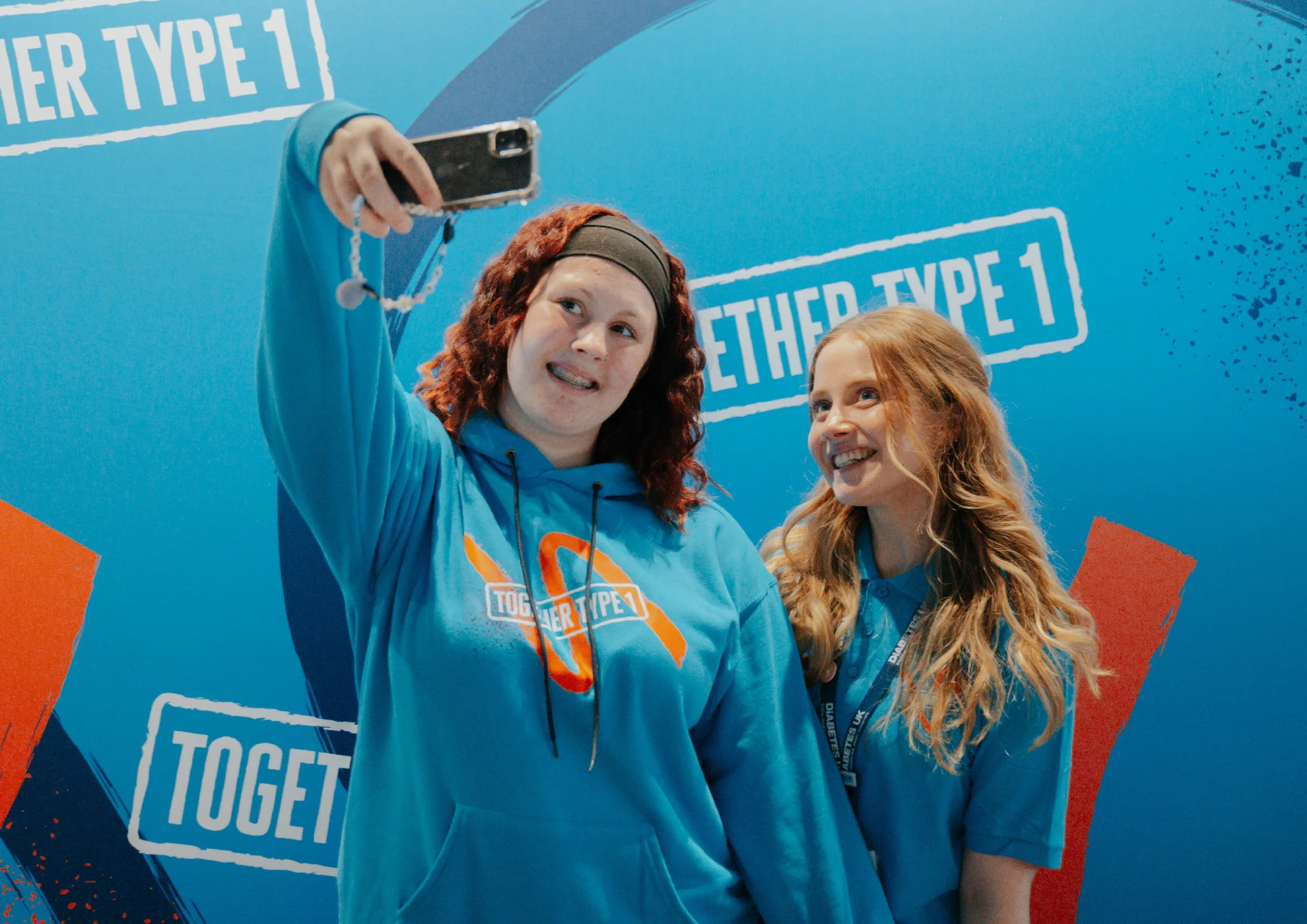
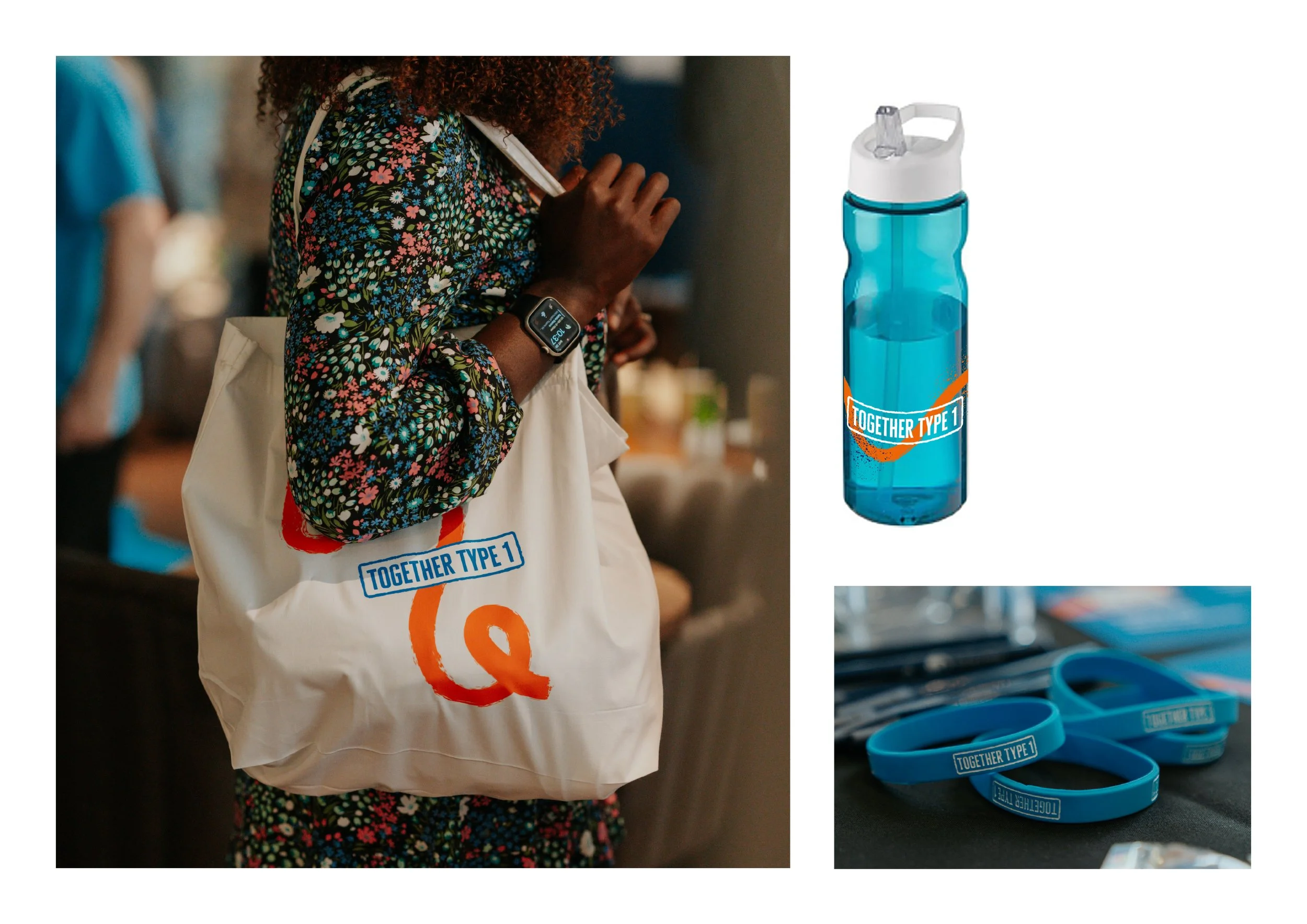
The branding (and its collateral) was completed in good time for the anniversary event. Goodie bags containing a host of branded items from hoodies/polo shirts to water bottles, wristbands and mugs were available for guests. The young leaders were thrilled with them and the feedback from the key stakeholders at Diabetes UK has been amazing.
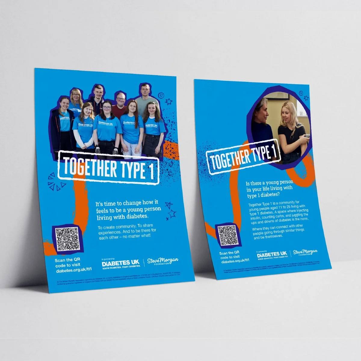
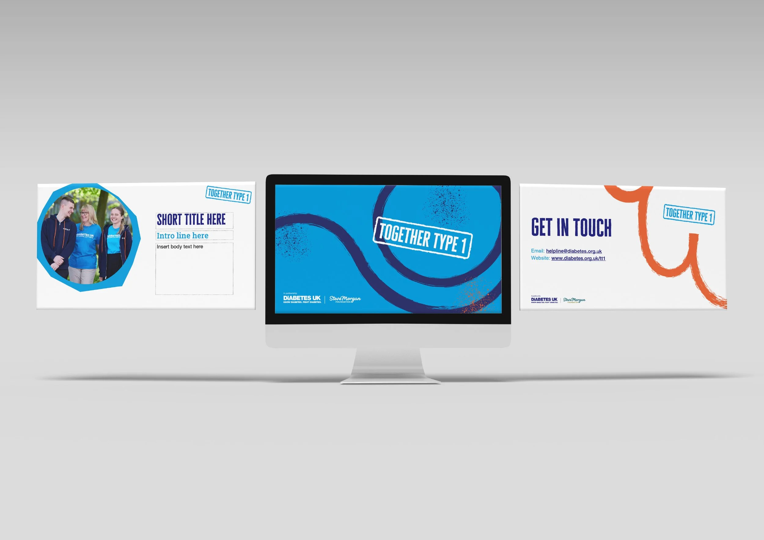
Diabetes UK have a set of design guidelines and a brand toolkit with associated assets for their in-house team to use going forward. They have a number of InDesign templates to also use internally and templates for use in RightMarket (an easy-to-use template solution) for local offices to quickly create social media graphics and flyers/posters for their local events.
“Collaborating with Claire has enabled us to roll out an ambitious new UK-wide programme. Claire seamlessly guided us through this large and complex project, enabling us to consult stakeholders and keep them engaged throughout. Adaptable from the beginning, Claire’s approach enabled us to deliver within our timescales and most importantly, deliver an outstanding creative that went far beyond our initial expectations.”
“Thanks so much Claire - honestly the visual identity and the name has come to life so perfectly. A huge, huge thank you for your collaborative work this project. It was emotional seeing everyone in their branded hoodies!”
“The result is a dynamic and meaningful ‘look and feel’ that resonates with our young audience but also feels part of our main brand. Claire is an incredibly talented and experienced Art Director. She is knowledgeable, creative, accurate and extremely organised as well as proficient in brand design. We owe much of the success of the launch of Together Type 1 to her work.”


