A Listening Life Podcast
| BRANDING | LOGO | GUIDELINES | TEMPLATES |
“Thank you, Claire, for your brilliant work as always in helping me bring A Listening Life into the world. You were able to play with the various threads of ideas that I brought, to create a brand that absolutely captures the vibe.”
Client
I’d previously done a rebrand and smaller projects for Aly’s coaching business, Clearworks. She then approached me about a side project she had been exploring that she wanted to get up and running. The new venture, A Listening Life, is initially focused on a podcast, with an accompanying website providing scope for growth at a later point.
With A Listening Life, Aly is taking her years of experience as a coach to provide tools and inspiration to other people who listen for a living, mainly self-employed coaches and therapists. The project came from her understanding of how easy it is for heart-led listeners to get so involved in the emotional side of their roles that they stop focusing on how to make their businesses viable and successful.
Collaborating with experts she’s met along her own journey, Aly is using the podcast to provide advice on marketing, finance and sales, covering the fundamentals of running your own business for those who like helping more than selling.
Brief
When Aly came to me, she hadn’t established the podcast yet – she wanted to start with the branding. She was looking for a visual identity that stood out, with a punchy business feel that combined with a sense of quirkiness and a feeling of nature to resonate with her core audience.
Aly shared visuals she was keen on from a previously successful project and added Being Freelance as a touchpoint for the feel of the tone. Whilst this project was mainly focused on branding for the podcast, she also needed graphics for social media and the website to ensure a consistent online presence.
Creative
I took Aly’s brief away to create an initial mood board, pulling together ideas and styling. I explored two main approaches at this stage. The first focused on the relationship between heart and head – the heart-led relationships those in listening careers have with their clients and patients and the way they need to lead with their heads when running their business. To avoid using an icon of an actual heart I instead explored the idea of the visual representation of a heartbeat.
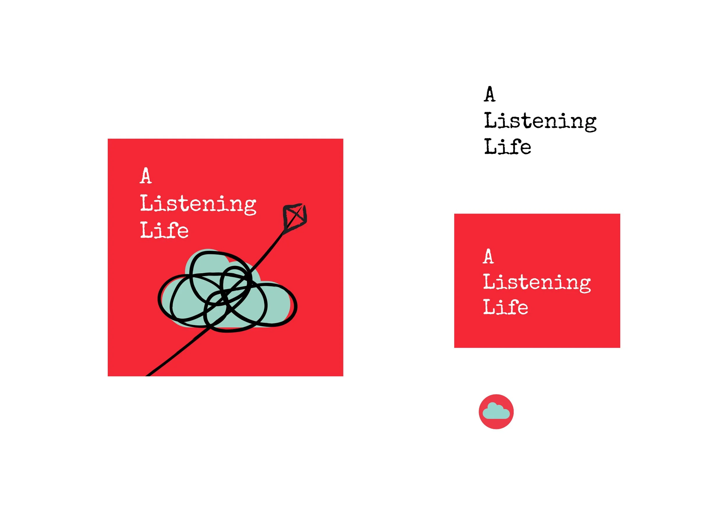
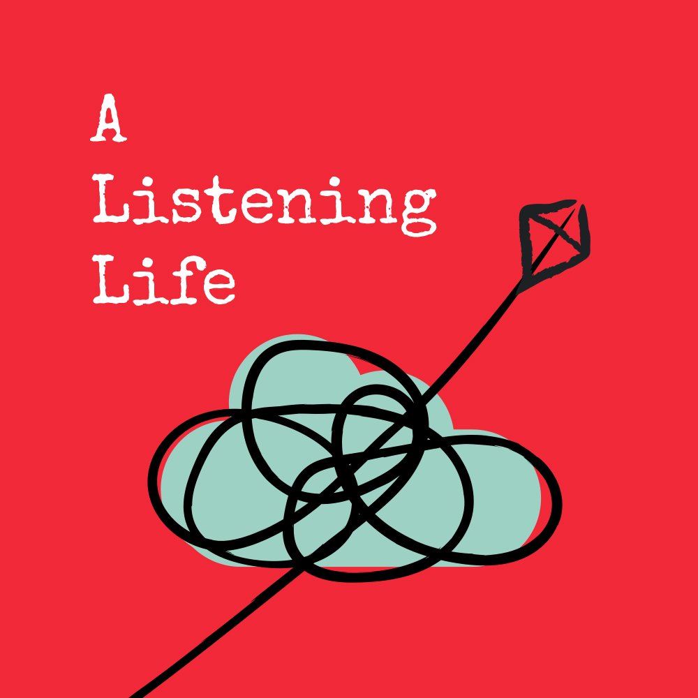
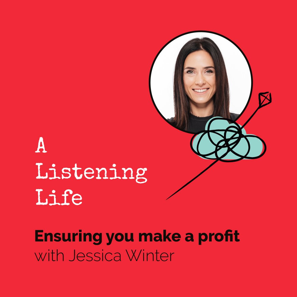
The other approach, which we eventually went with, stemmed from the idea of most business and career progression being ‘squiggly’ rather than linear. I put together some designs that suggested the reality of running a business while incorporating natural shapes like clouds to convey the idea of moving through the fog and coming out the other side. I took it one step further by adding the playful element of the kite giving a lift to succeed and meet high ambitions.
I started playing with softer shades for the palette, looking at colours most associated with wellbeing brands and then incorporated a strong red to symbolise the business element. This blend of the more natural muted green and punchier corporate red captures the balance of content in the podcast.
Impact
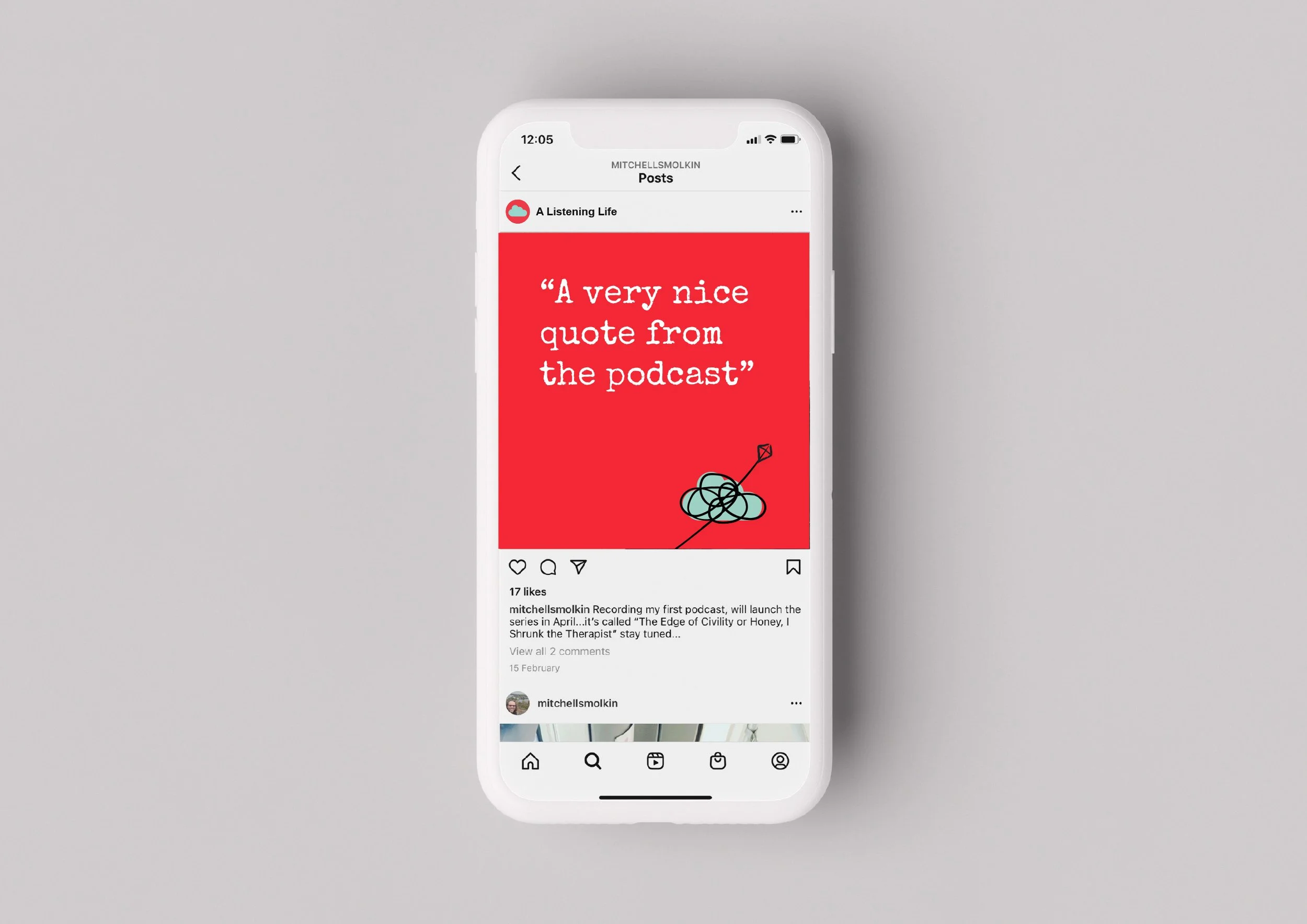
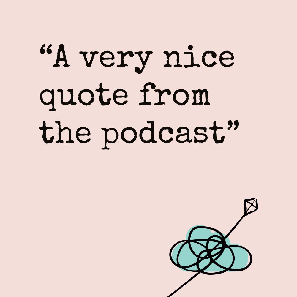
Aly went away with artwork for the podcast, Canva templates for social media, graphics for the new website which she put together and a brand board with key brand elements to help her maintain consistency.
It’s unusual for a service-based business to start with the brand first and let the visuals lead. But Aly wanted to be able to use a strong visual identity to drive the project and bring in guests for the podcast and it’s working – she’s been busy creating podcast episodes and content.
“How would anyone ever be able to take the brief to combine a strong bright red for dynamic sales, with ‘a gentle yogi type colour’ for the gentle coaches who are our clients? You did it and we’re finding the whole palette and assets gorgeous to work with. Thank you”


