Clearworks Coaching
| BRANDING | LOGO | WEBSITE | TEMPLATES |
“Claire did a really fantastic job of taking the complicated ideas I had flying around and translating them to a beautiful and exciting new brand to celebrate our 8th birthday in business.”
Client
The Clearworks team provides coaching with a focus on female leaders in the STEM, pharma and biotech sectors.
When I set up West9 Design, I started listening to the Being Freelance podcast, joined the Facebook group and added myself to the directory on their website. Aly found my details on there and got in touch about her branding. We hit it off straight away – I was very interested to hear about her business, where she was at and what she was looking to do.
I put together a joint proposal with a web developer I work with. Andy Tough would develop the website and I would work on the design and branding.
Brief
Clearworks is involved with big brands like Biogen and AO and Aly wanted to level up her game to look more professional but avoid coming across as too corporate. She was looking for a balance between proving the business knows what it’s talking about and demonstrating the personality and energy that sets them apart from their staler competitors.
Aly had her branding done early on in her journey with Clearworks, when she wasn’t entirely sure which direction she was going to take the business in. Eight years on, she felt the branding and the business as it is now jarred with each other, and she wanted to rebrand for the eighth anniversary to give more of a sense of the energy and innovative feel of the business.
Creative
I started the process with a discovery session with Aly where we spoke in depth about the business and how she wanted it to come across. I then went off and created some initial mood boards. There was a slight panic at the first iteration but after another conversation with Aly to further understand the business reasons behind the design work we were moving in the right direction. Moments like this are why I keep in touch with clients throughout each of the design stages, to make sure it’s a collaborative and joined up process that always fulfils the brief.
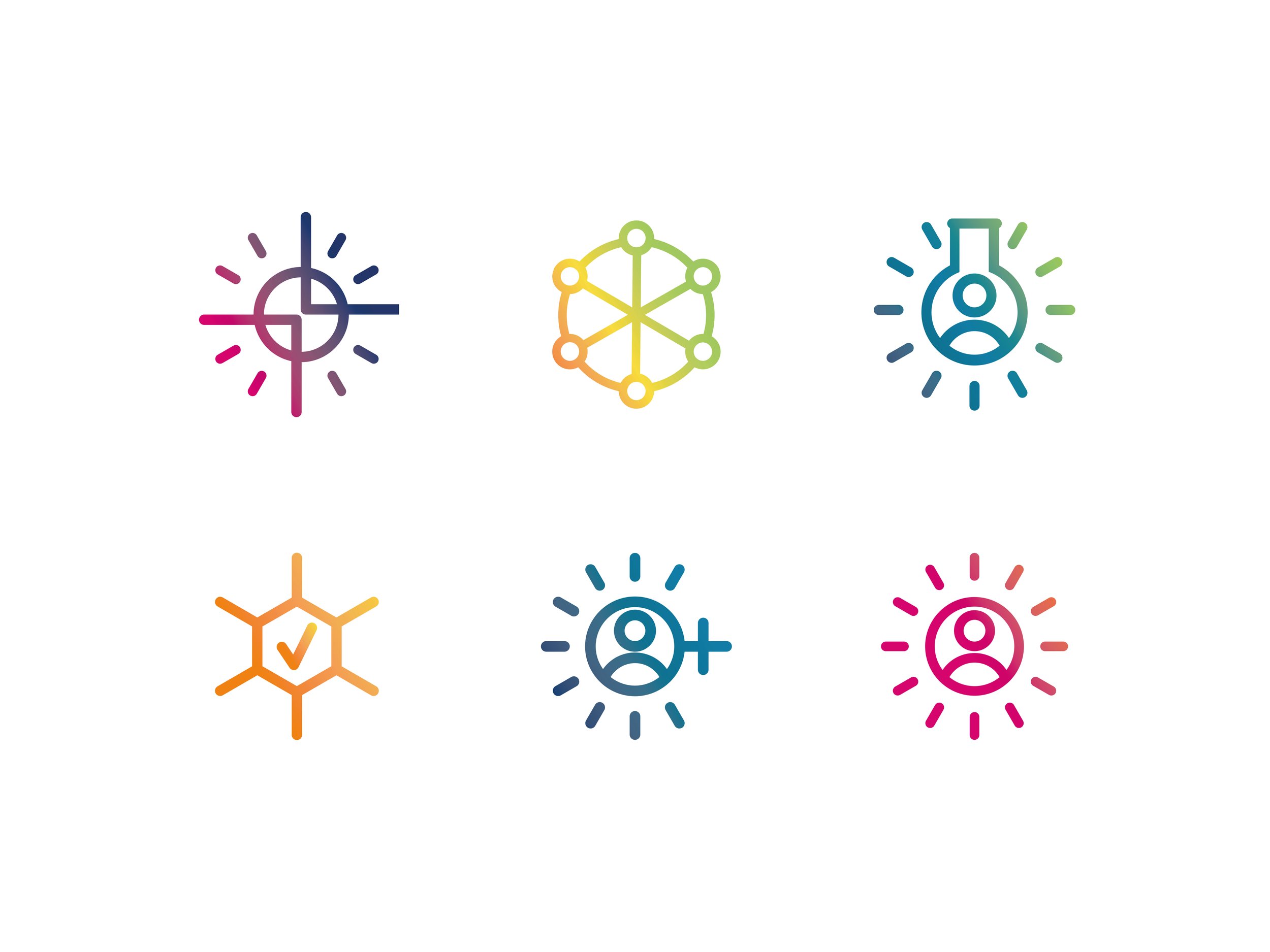
I then worked up two different visuals for the logo and Aly chose her favourite, which is built on the concept of a six-person circle used in Clearworks coaching. The image plays with the idea of DNA strands and has an energetic and experimental feel. The colours reflect the STEM sector as well as the bright, optimistic and innovative values held by Clearworks. Being able to use the different elements in a range of ways gives this visual identity versatility and flexibility.
Impact
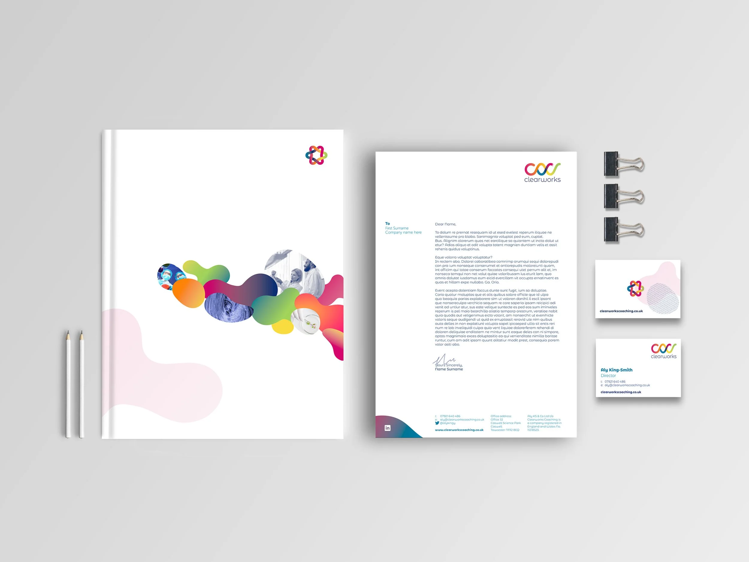
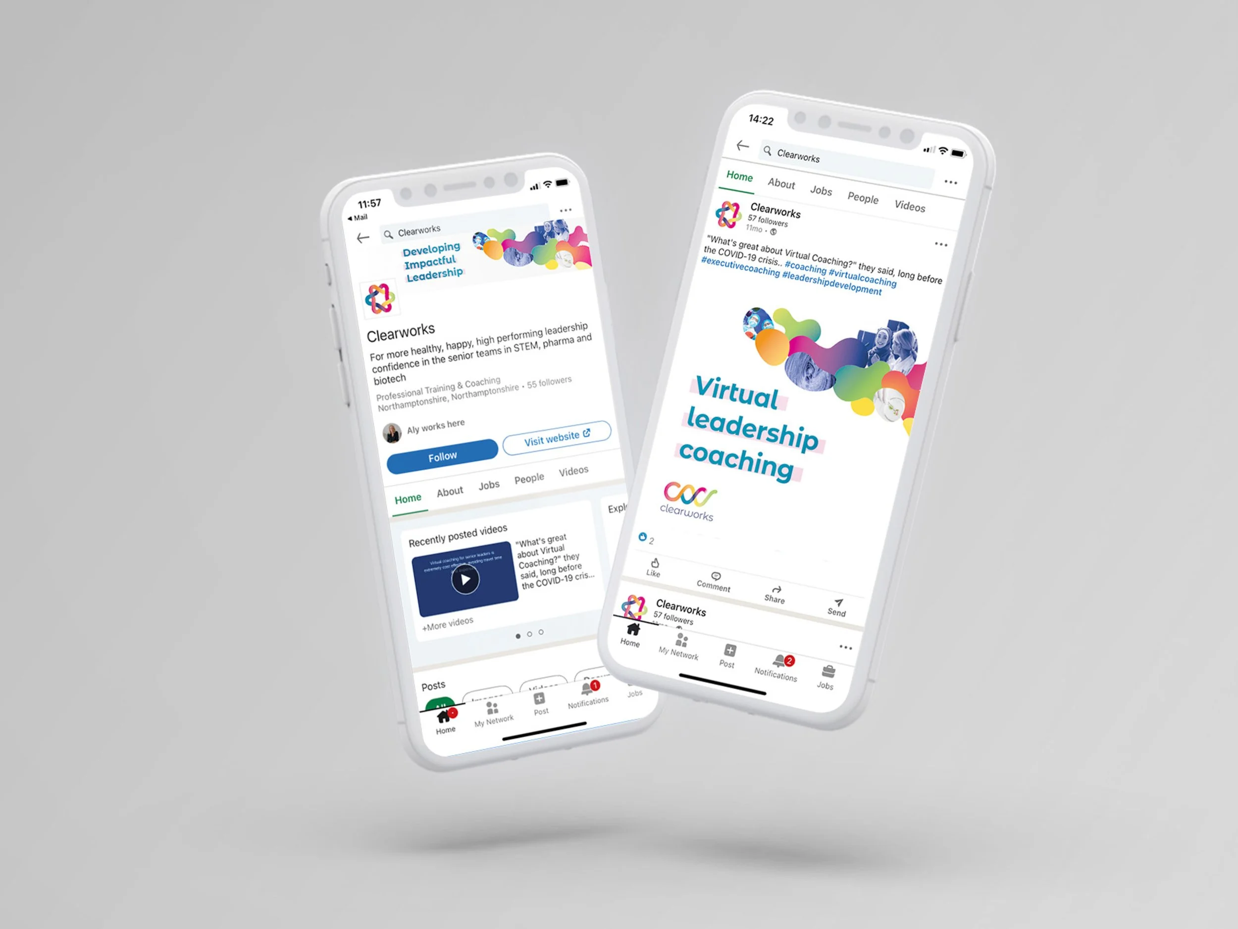
Once the visuals had been refined and approved, I created a set of brand guidelines and social media and PowerPoint templates. Aly is using all these elements for Clearworks and is really happy with them. She has since come back to me with more projects to maintain consistency across her branding.
Clearworks Coaching Website Design by West9 Design Ltd
“Our previous brand wasn’t reflecting us in 2021 and we wanted to add energy and a funkier feel. The first mood board that Claire trialled made me panic as it wasn’t quite there – but she was calm as you like and used that conversation to make a step change and suddenly, kapow!!! – she pulled a rabbit out of a hat, and aligned so clearly to the sector, the offer and the vibe.
Claire has helped us build the brand look and feel that we need to step up to the next level, and all of it has been done with fun and energy. She’s really prompt, responsive and timeline driven. Finding a great creative who is also pushing for deadlines and progress is really fantastic.
Her commercials are clear and fair too. Really highly recommended.”


