The New Malden Town Centre Partnership
| BRANDING | LOGO | BRANDBOARD | TEMPLATES |
“I can highly recommend working with Claire, you are guaranteed to get a professional, good quality product with fantastic customer service.”
Client
The New Malden Town Centre Partnership (NMTCP) is a group of representatives from local community organisations, businesses and residents, working to promote the town centre as a focus for local community activities and celebrate its cultural diversity. The project is funded by the Greater London Assembly and the NMTCP is supported by Kingston Council.
I was put forward to work on this project by Kingston Chamber of Commerce. My primary point of contact was Danielle at Kingston Council.
Brief
The NMTCP needed a visual identity that would represent New Malden in a meaningful, positive way. There is no single, instantly recognisable symbol that people would associate with the town, so I needed to create this identity.
The design was going to be seen by a wide range of people, from shoppers and residents to businesses and needed to appeal to a broad spectrum of ages and backgrounds.
Creative
As well as a varied audience – making the messaging harder to define – this project involved a complex collection of stakeholders from all the interested parties and community groups.
During a discovery session with Danielle, I came to understand more about the aims of the project, bringing people together and improving the social spaces in New Malden. The NMTCP wanted the town’s personality to come across as inclusive, diverse, caring and enterprising, with a focus on looking towards the future.
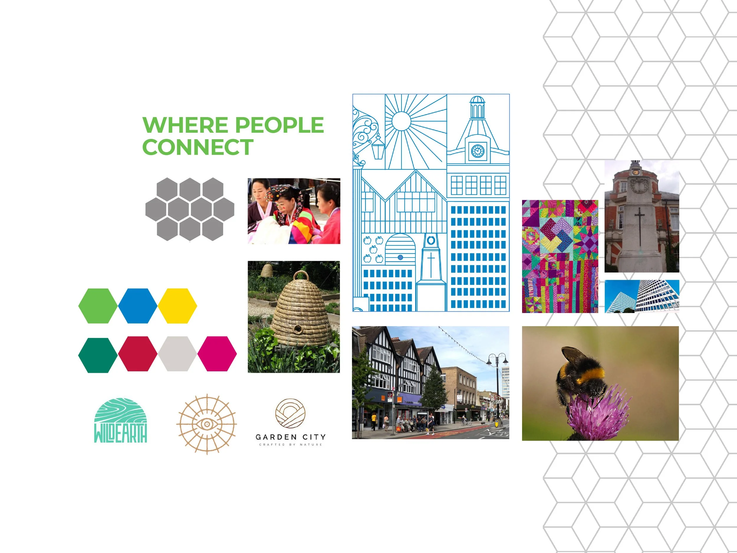
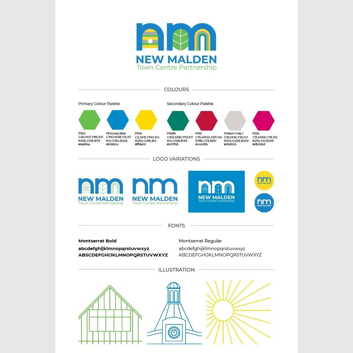
Without a single, obvious icon to represent New Malden, I decided to create a range with a connection to the geography and history of the town as well as the various groups involved. The History Society (who were a part of the NMTCP) had shared that there was a background of honey production and beekeeping in the area. There were multiple environmental groups engaged in the project and promoting green spaces is an important element. There is also a striking fountain at the entrance to the town. From these elements I created a series of icons: a beehive, a leaf and water flowing from the fountain. See moodboard below.
With so many stakeholders involved the process was less straightforward than some projects for individual clients. We established a branding subcommittee and were able to move forward with more freedom which helped when agreeing and refining the new visual identity.
Once the icons had been approved as appealing to the broad spectrum of interested parties and presenting a visual identity to be proud of, I established an accompanying colour scheme and provided some additional line drawings. These visuals were inspired by the Tudor buildings around New Malden.
Impact
This was a project that involved taking lots of different views into account and was a more complicated process than some, but I’m pleased with the end result.
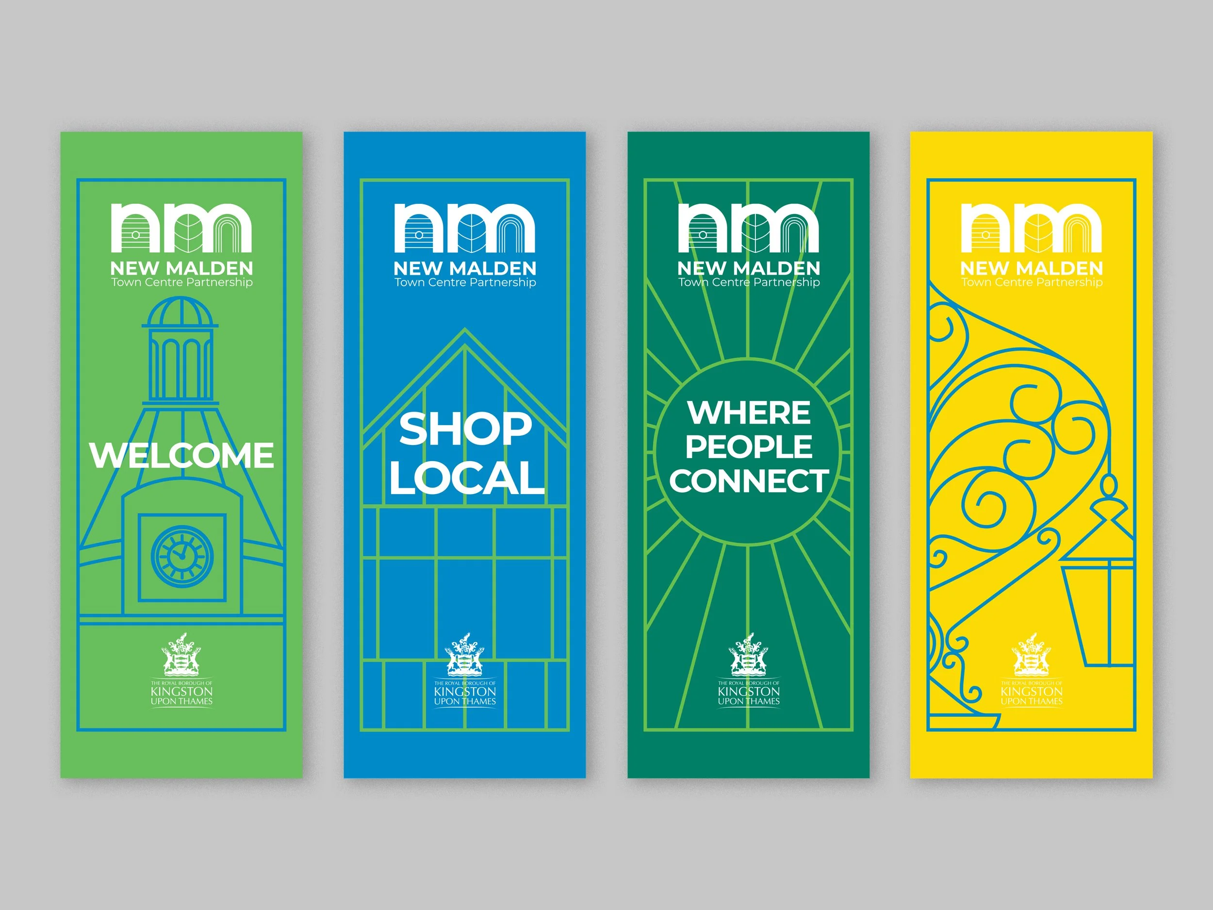
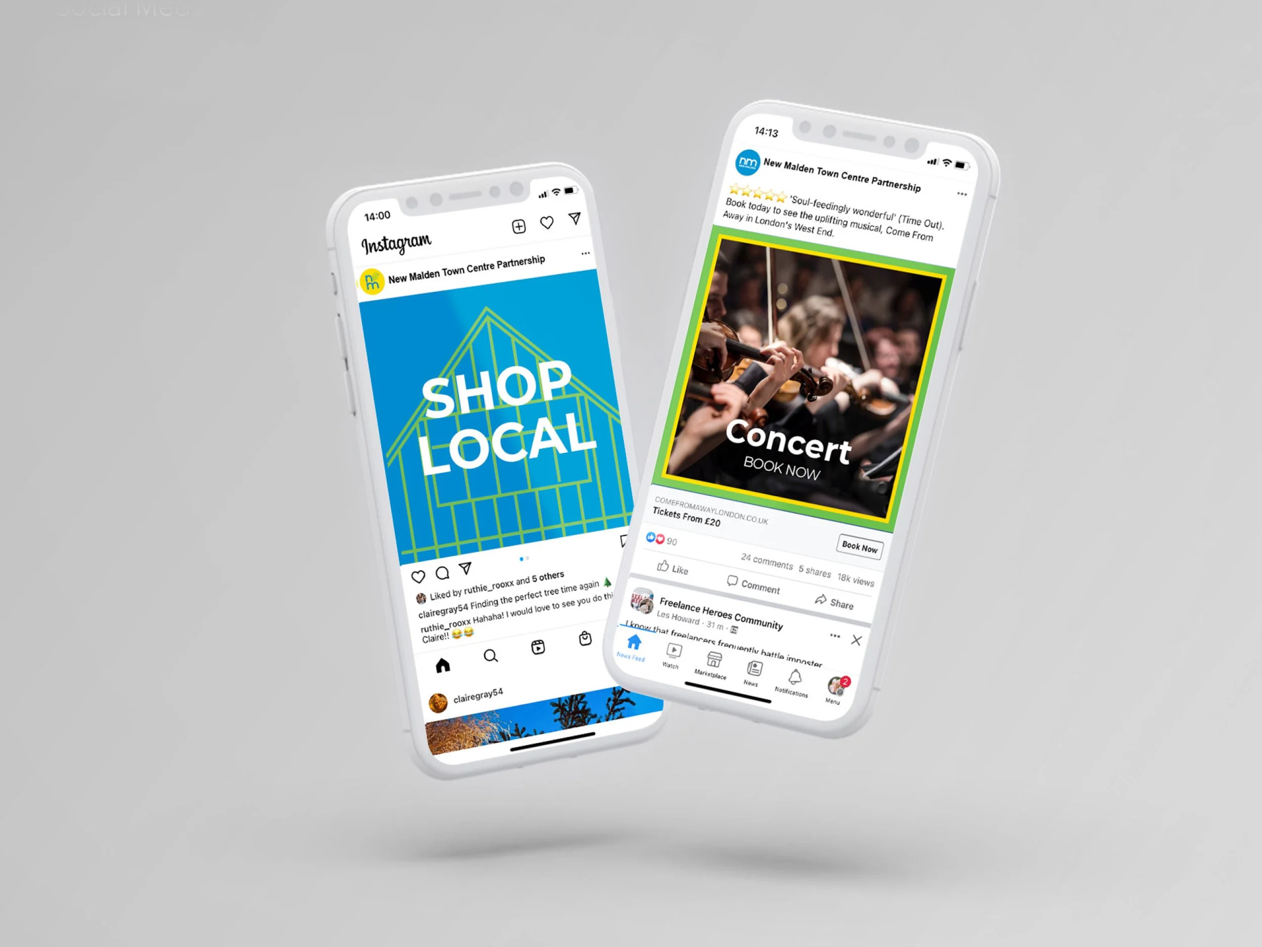
The branding is in place thanks to banners throughout New Malden and the social media templates are providing a consistency to the group’s work. I gave Danielle tutorials on the Canva templates and she’s finding them easy to work with.
“Claire helped New Malden Town Centre Partnership develop its brand look and feel, she created the organisation logo in consultation with various stakeholders and designed banners to brighten the local high street. Claire’s task was tricky, in that there were many people with differing views to satisfy, nevertheless she showed great patience, good humour and generosity of spirit which resulted in a sharp, fresh, fun and inviting design which the whole team are happy with.”


