The Inner
Potential
| BRAND REFRESH | BRANDBOARD | TEMPLATES |
“I would recommend Claire to anyone wanting a new or refreshed look for their business, she has so many ideas and expertise, is so easy to work with and her work is excellent!”
Client
With The Inner Potential, Suzanne provides executive coaching, consulting and mentoring to help organisations and individuals uncover their untapped potential in order to progress and achieve. Her background is in the corporate world, and she brings that experience to her business.
I met Suzanne at a speed networking event through the local chamber of commerce. Despite the two-minute time limit we hit it off and decided to have a one-to-one to get to know each other better. A while later Suzanne approached me to talk about her branding. She was happy with elements of her existing brand, including the logo and some of the colours but wanted a fresh, more consistent approach, particularly adding more variety to give her flexibility.
Brief
The brief was to enhance the branding for The Inner Potential. Suzanne felt the existing visuals were limiting her and she wanted to make the move away from more obvious stock library imagery towards elements that linked to her and the business and had clear meaning behind them.
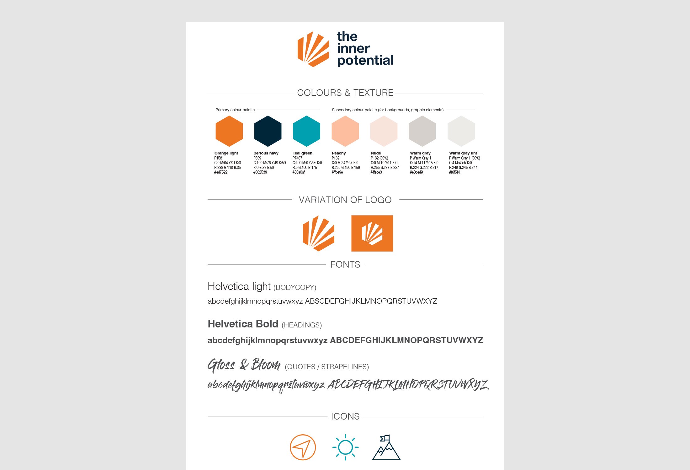
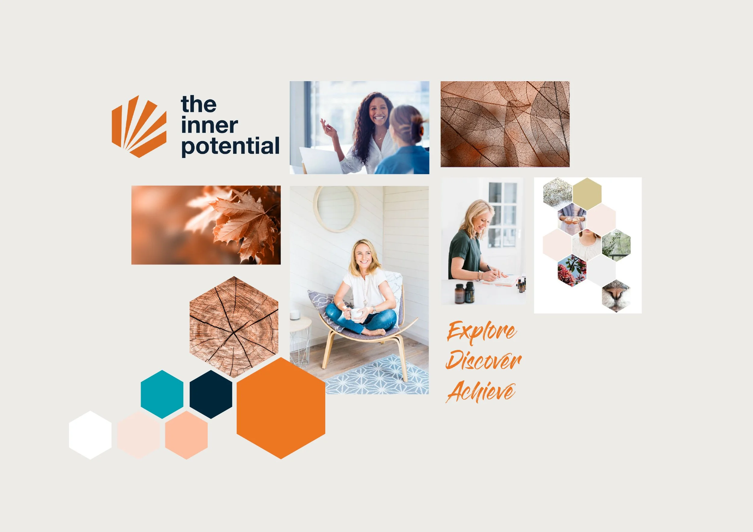
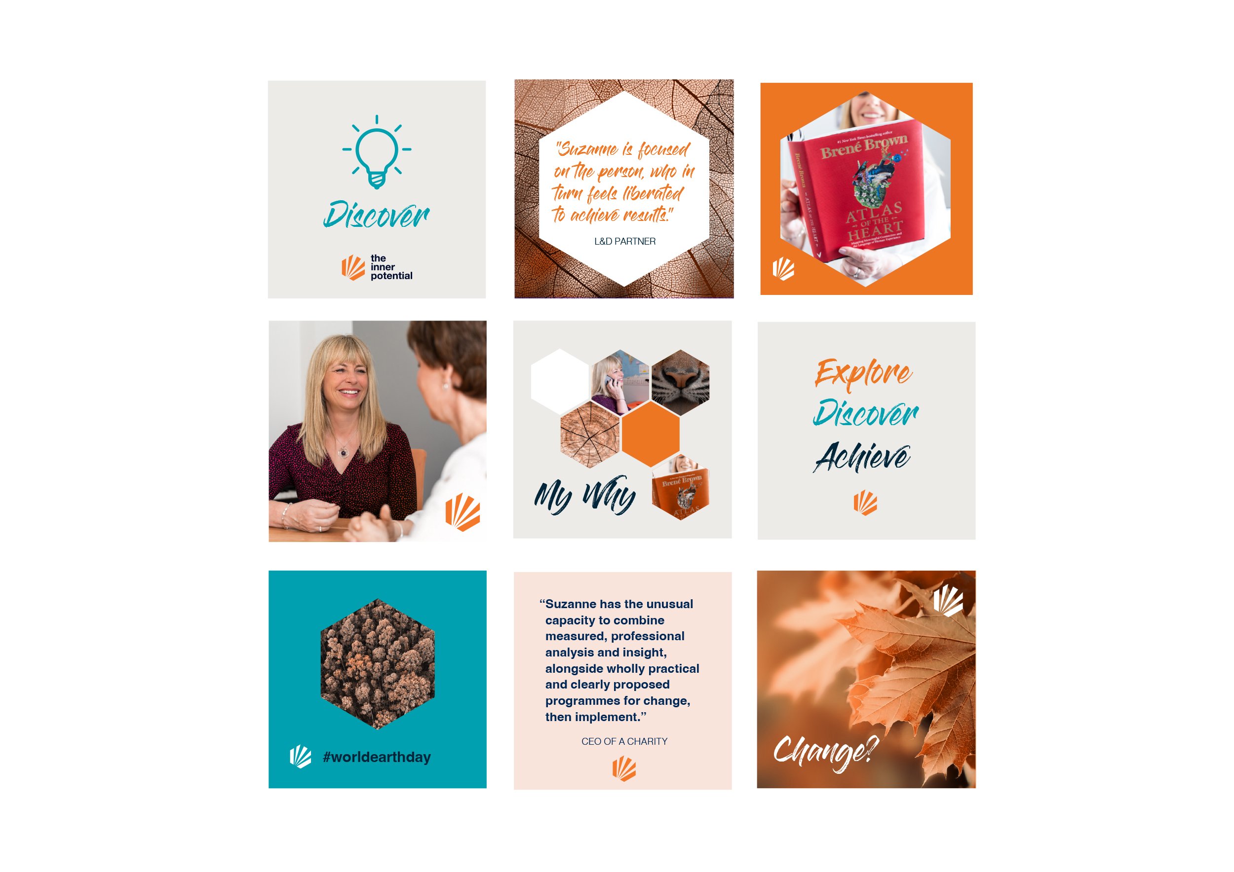
The branding package included a brand board and templates for Suzanne to use moving forward.
Creative
On our initial deep dive, I discovered Suzanne is a lover of the great outdoors and that she was keen to bring the environment into her business as much as possible. She was already planting a tree for each new client that joined her and there was messaging around that initiative but there was room to develop this element further in her visual branding.
Imagery with echoes of nature provided a chance to suggest growth, looking within yourself and seeing the light of your own potential through abstract representations, as well as connecting with the organic look of the existing logo.
I came up with an initial mood board which included an expanded colour palette and Suzanne chose the direction she wanted to take. I then put together inspiration for a photoshoot she was having with Rebecca Challis, a photographer I collaborate with, and provided a brief for Suzanne to sign off. I included certain colours with suggestions of how to inject them into the images to add brand consistency to the photographs.
When the images were ready, I had something to play with and refine for the social media graphics. Once they were approved, I created templates, so Suzanne has what she needs to consistently put out on-brand content. I incorporated a new font with a more handwritten feel to give Suzanne more flexibility and options. The branding package also included guidelines covering all aspects of the new visual identity for The Inner Potential.
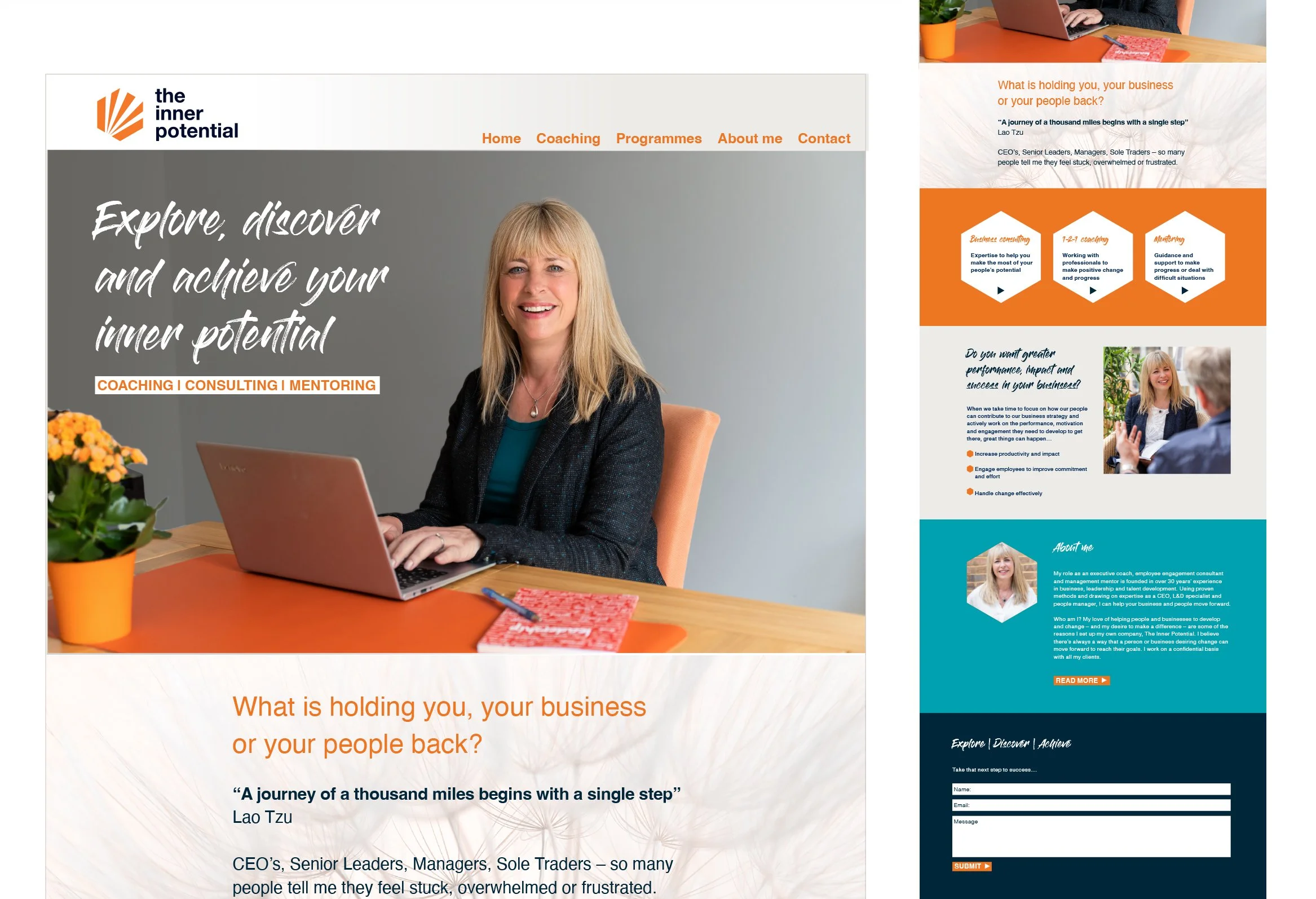
The final piece I put together was a rough outline of how the new branding elements could sit together on a homepage. Suzanne was then able to pass this on to her web developer and the website is now live.
Impact
Suzanne has been using her new templates and getting on really well with them. She’s happy with how everything looks, and The Inner Potential now sparks a clear sense of brand recognition thanks to the new consistent look and feel.
“Claire is a very experienced brand consultant, and I found her advice and work to be based on great ideas and quality work. I approached her to help me with a refresh of my company’s brand after 4 years in business and she worked wonders, building on the parts I wanted to keep and expanding the ideas into a design and look that can represent my business consistently and professionally.”


